Difference between revisions of "MATLAB:Plotting"
m |
m |
||
| Line 49: | Line 49: | ||
== Using Different Line Styles == | == Using Different Line Styles == | ||
| − | Most of the time, you will be plotting three or fewer different lines on a single window, and they can thus be distinguished from one another in [[MATLAB]] by using different line styles. There are two different ways to get multiple data sets plotted in the same figure - use the <code>hold on</code>...<code>hold off</code> paradigm or | + | Most of the time, you will be plotting three or fewer different lines on a single window, and they can thus be distinguished from one another in [[MATLAB]] by using different line styles. There are two different ways to get multiple data sets plotted in the same figure - use the <code>hold on</code>...<code>hold off</code> paradigm or put all the "plot triplets" in a single plot command. What follows is an example of the latter case: |
<source lang="matlab"> | <source lang="matlab"> | ||
x = linspace(0, 1, 100); | x = linspace(0, 1, 100); | ||
Revision as of 15:27, 18 September 2009
This page will primarily go over some examples of different ways to plot data sets.
Contents
General Plotting Tips
You must make sure that your data sets are presented properly. Here are some guidelines:
- Include axis labels that have, when appropriate, units. You should also include a description of the variable, or the variable itself, or both. For example, on p. 285 of Chapra[1], there is a plot of force versus velocity. Appropriate x axis labels would include any of the following:
xlabel('{\it v}, m/s')
xlabel('{\it v} (m/s)')
xlabel('Velocity, m/s')
xlabel('Velocity (m/s)')
xlabel('Velocity ({\it v}), m/s');
xlabel('Velocity ({\it v}, m/s)');
|
- You should be consistent within a single graph as far as which version you use, and you should pick which format you believe conveys the information most efficiently and effectively.
- Make sure your titles make sense and that you have your NET ID in one of the titles for each figure you create. If you have multiple subplots, you only need one of the titles to have your NET ID. Typically, the title will read "DEP. VAR vs. INDEP. VAR for DESCRIPTION (NET ID)" where DEP. VAR is your dependent variable (typically on the y axis), INDEP. VAR is your independent variable (typically on the x axis), DESCRIPTION is something that will differentiation this particular plot from others that might have the same variables (for example a data, or an experiment number), and NET ID is your NET ID.
- Data points should be represented by symbols and model equations should be represented by lines. Be sure to use a legend to identify each item plotted if there are multiple data sets on the same graph.
- Typically, you will want to set the axis limits such that no data point is on the figure boundary. Certainly you do not want a line to be plotted on top of a figure boundary. After you make a plot, if there is a data point on an edge, look at the current axes and go out a little bit. Just make sure if you end up fundamentally changing your code that you adjust the axes accordingly. Alternately, you can use the gzoom function below to automatically expand the graph.
Keeping Data Off The Edge
Typically, you will not want data points to land on the edge of a graph. If you are just plotting lines, this is not a problem but if you are actually putting symbols at each point, those symbols should not cross the border out of the axes. To combat this, you can put a short program called gzoom.m into your directory and run it. The default case is to add 10% to each direction of the graph in the first figure. The first argument specifies what the expansion value should be (if you want it different from 0.1) while the second argument specifies which figure should be expanded (if you want it to be different from the first figure). The gzoom function is:
function gzoom(n, f)
% gzoom.m
% Michael R. Gustafson II (mrg@duke.edu)
% Uploaded to pundit.pratt.duke.edu on September 6, 2008
%
% Function to determine the size of a figure window and increase the size
% GZOOM will increase figure 1 by a factor of
%       0.1 of the original size in each direction
% GZOOM(r) will increase figure 1 by a factor of
%       r of the original size in each direction
% GZOOM(r, f) will increase figure 1 by a factor of
%       r of the original size in each direction

if nargin==0
    f=gca; n=0.1;
elseif nargin==1
    f=gca;
end
v=axis;
xr = (v(2)-v(1));
yr = (v(4)-v(3));
axis(f, [v + n*[-xr xr -yr yr]]);
Using Different Line Styles
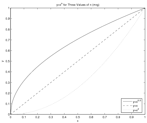
Most of the time, you will be plotting three or fewer different lines on a single window, and they can thus be distinguished from one another in MATLAB by using different line styles. There are two different ways to get multiple data sets plotted in the same figure - use the hold on...hold off paradigm or put all the "plot triplets" in a single plot command. What follows is an example of the latter case:
x = linspace(0, 1, 100);
y1 = x.^0.5;
y2 = x.^1;
y3 = x.^2;
plot(x, y1, 'k-', x, y2, 'k--', x, y3, 'k:');
legend('y=x^{0.5}', 'y=x', 'y=x^2', 0);
title('y=x^n for Three Values of n (mrg)');
xlabel('x');
ylabel('y');
print -deps CurvePlot % note that adds .eps to filename
The figure this creates will be:
Note the legend - the use of the final argument 0 will make MATLAB look for the best spot in the window for the legend - which is to say, somewhere not conflicting with any of the lines if at all possible. Also note that the text in the legend and in the title contains basic LaTeX code for obtaining the superscripts.
Using Different Point Styles
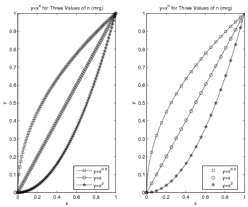
Sometimes there will be more data sets on a graph than there are line styles in MATLAB. In cases like this, you may think to use symbols at the points. The problem with that becomes clear if you have a large number of data points - you do not want to try to jam hundreds of symbols onto a curve. The left graph in the figure below shows what a disaster that could be. Instead, you can plot a line with all your data but plot points on top of the line with only some of the data. The right side of the figure shows the result of this operation. The code for both graphs in the figure is given below it.
x = linspace(0, 1, 100);
y1 = x.^0.5;
y2 = x.^1;
y3 = x.^2;
subplot(1,2,1) % left graph (ewwwwwww)
plot(x, y1, 'k-s', x, y2, 'k-o', x, y3, 'k-p');
legend('y=x^{0.5}', 'y=x', 'y=x^2', 0);
title('y=x^n for Three Values of n (mrg)');
xlabel('x');
ylabel('y');

subplot(1,2,2) % right graph (ooo.  aah.  wow)
plot(x, y1, 'k-', x, y2, 'k-', x, y3, 'k-'); % lines only!
incr = 5;
hold on % holds lines and now add points
PointPlot=plot(...
    x(1:incr:end), y1(1:incr:end), 'ks',...
    x(1:incr:end), y2(1:incr:end), 'ko',...
    x(1:incr:end), y3(1:incr:end), 'kp');
hold off
legend(PointPlot, 'y=x^{0.5}', 'y=x', 'y=x^2', 0);
title('y=x^n for Three Values of n (mrg)');
xlabel('x');
ylabel('y');
Note that the assignment of one of the plots to the variable PointPlot is required so that the legend can be told which set of
plots to use as a basis for the legend. Without this, it would be
possible for the legend to be based on the plot using solid lines (which are
the same for all three data sets) rather than to be based on the
plot using the symbols.
Using Different Scales
In the above example, two different scales were used for the data sets - a refined scale for the line and a rougher scale for the data points themselves. In other cases, it is the line that will need the rougher scale. As an example, assume you want MATLAB to numerically find the minimum of the function \(y=3x^2+11x-2\) using the built-in min command. To get the most precise answer possible, you will want to give MATLAB a very large number of points - say, 1 million. That code might look like:
P = [3 11 -2]
xVals = linspace(-3, 3, 1e6);
yVals = polyval(P, xVals);
yMin = min(yVals)
xMin = xVals(find(yVals==yMin))
Since the domain is 6 and there are 1e6 points, the spacing between points is approximately 6e-06. The x-coordinate of the answer then should be very close to the actual answer. In fact, MATLAB determines that the minimum value is -1.208333333332658e+01 and its x-coordinate is -1.833334833334833e+00 - very close to finding the minimum of y=-1.208333333333333e+01 at x=-1.833333333333333e+00
The problem, however, is that if you want to graph this, one million points is somewhat absurd. Unless you are planning to zoom in on the graph, there are around 1000x as many points as necessary/realistic/useful for a plot like this. Instead, you should either recalculate the equation using a smaller set of independent data or plot only some of the data. Code for the former might be:
xPlot = linspace(-3, 3, 100);
yPlot = polyval(P, xPlot);
plot(xPlot, yPlot, 'k-');
xlabel('x');
ylabel('y');
title('y=3x^2+11x-2 (mrg)');
grid on
print -deps PolyGraph
while code for the latter might be:
plot(xVals(1:1000:end), yVals(1:1000:end), 'k-');
xlabel('x');
ylabel('y');
title('y=3x^2+11x-2 (mrg)');
grid on
print -deps PolyGraph
The advantage of the first version above is that your domain definitely remains the same - the xPlot variable spans the same [-3, 3] as the xVals set even though it has three orders of magnitude fewer values. The disadvantage is that you will have to re-perform all the calculations on this new set.
The advantage of the second version, then, is that you are using prior data and thus do not have to recalculate anything. The disadvantage is, you might miss out on the tail end of the data. In the above example, going from 1 to 1e6 by 1e3 means the last value copied over will be 999001, meaning the maximum value used on the x-axis is xVals(999001) or approximately 2.994 instead of the 3 in the original. If that is a major concern, you should make sure the end of your refined data scale can be "reached" if your incremented indices start with 1 and have some increment. As an example, choosing to have 1000001 points in the original instead of 1000000 means going from 1 by 1e3 to 10000001 will actually end at the 10000001st, and last, point.
Putting Text on a Plot
The text(x, y, MyText)
command will plot the text string MyText at
the (x,y) coordinate. There are several important aspects to the text
command you must remember to use it properly.
First, the text command will not make the figure change its axes
to fit the data automatically. Clear the figure using clf then try typing:
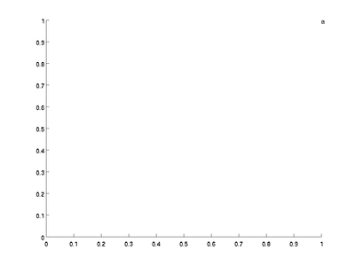
text([1; 2; 3], [1; 2; 3], ['a'; 'b'; 'c']);
and you will get the graph:
Note that the letter a is just visible at the top right corner
but b and care totally missing. You need to manually
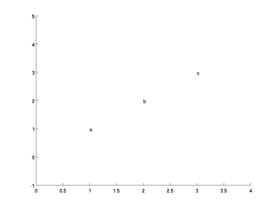
changes the axes by using the axis command. In this case,
axis([0 4 -1 5])
will make the x axis go from 0 to 4 and the y axis go from -1 to 5, more than enough space to see all three letters:
Next, note that
text placed on plots stays until the next plotting command is
issued, so you can use multiple text commands to get several
labels on one plot. Also, the arguments can be column vectors which
allows multiple labels to be added at once (such as in the above
example). Note that row vectors do not work. Clear the figure
using clf then try the following:
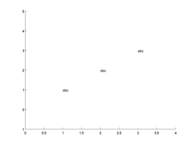
text([1 2 3], [1 2 3], ['a' 'b' 'c']);
axis([0 4 -1 5]);
This gives you:
Because you gave rows of labels instead of columns, text puts the
letters abc at each data point. In this case, you can solve the problem by transposing the third argument.
Also, the text must be...text. If you try to label using numbers you will get an error. Try
text([1; 2; 3], [1; 2; 3], [1; 2; 3]);
axis([0 4 -1 5]);
Fortunately, MATLAB has a command called num2str that will
convert numbers to strings. Clear the figure and try
text([1; 2; 3], [1; 2; 3], num2str([1; 2; 3]));
axis([0 4 -1 5]);
and you will get
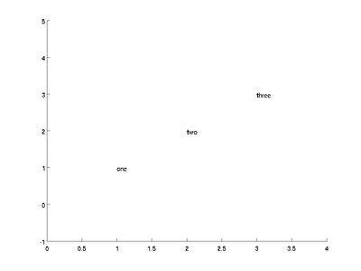
Finally, if you put multiple pieces of text on at once, they must all be
the same size. You can ensure that they are by using the str2mat command. Clear the figure and try:
text([1; 2; 3], [1; 2; 3], str2mat('one', 'two', 'three'))
axis([0 4 -1 5]);
The str2mat command will automatically pad the shorter words with spaces, and the text command will give you:
Questions
Post your questions by editing the discussion page of this article. Edit the page, then scroll to the bottom and add a question by putting in the characters *{{Q}}, followed by your question and finally your signature (with four tildes, i.e. ~~~~). Using the {{Q}} will automatically put the page in the category of pages with questions - other editors hoping to help out can then go to that category page to see where the questions are. See the page for Template:Q for details and examples.
External Links
References
- ↑ Applied Numerical Methods with MATLAB for Engineers and Scientists, 2/e, Steven C. Chapra
